
An in-depth look at how Ozmo’s Experience & Design team enhanced the customer self serve experience
At Ozmo, we’re constantly examining our content when it comes to what questions and problems exist for customers while developing solutions around them. Taking our literal content aside, there’s an experience that exists around the content enabling customers to sort through our library of content and find the answer they're looking for. This is Ozmo self serve and is one of many products at Ozmo that the Experience & Design team works on every day.
With the 3.2 release of our customer self serve offering, Ozmo has made great strides in creating more seamless means for users to find the right content. Months ago, we began an investigation into the current state of the product where we asked two questions: how do customers expect to find the content they’re looking for and can they find it easily?
The Experience & Design team at Ozmo poured over analytics, looking at metrics such as utilization and how far into Ozmo’s help content users were progressing. Taking these goals of delivering even more customers to the most helpful answers, the Design team developed several hypotheses for potential areas that might be hindering solution seekers.
Research
Hypothesis #1: Having more routes or abilities to arrive at a possible answer is valuable and it ultimately results in guiding more people to solutions.
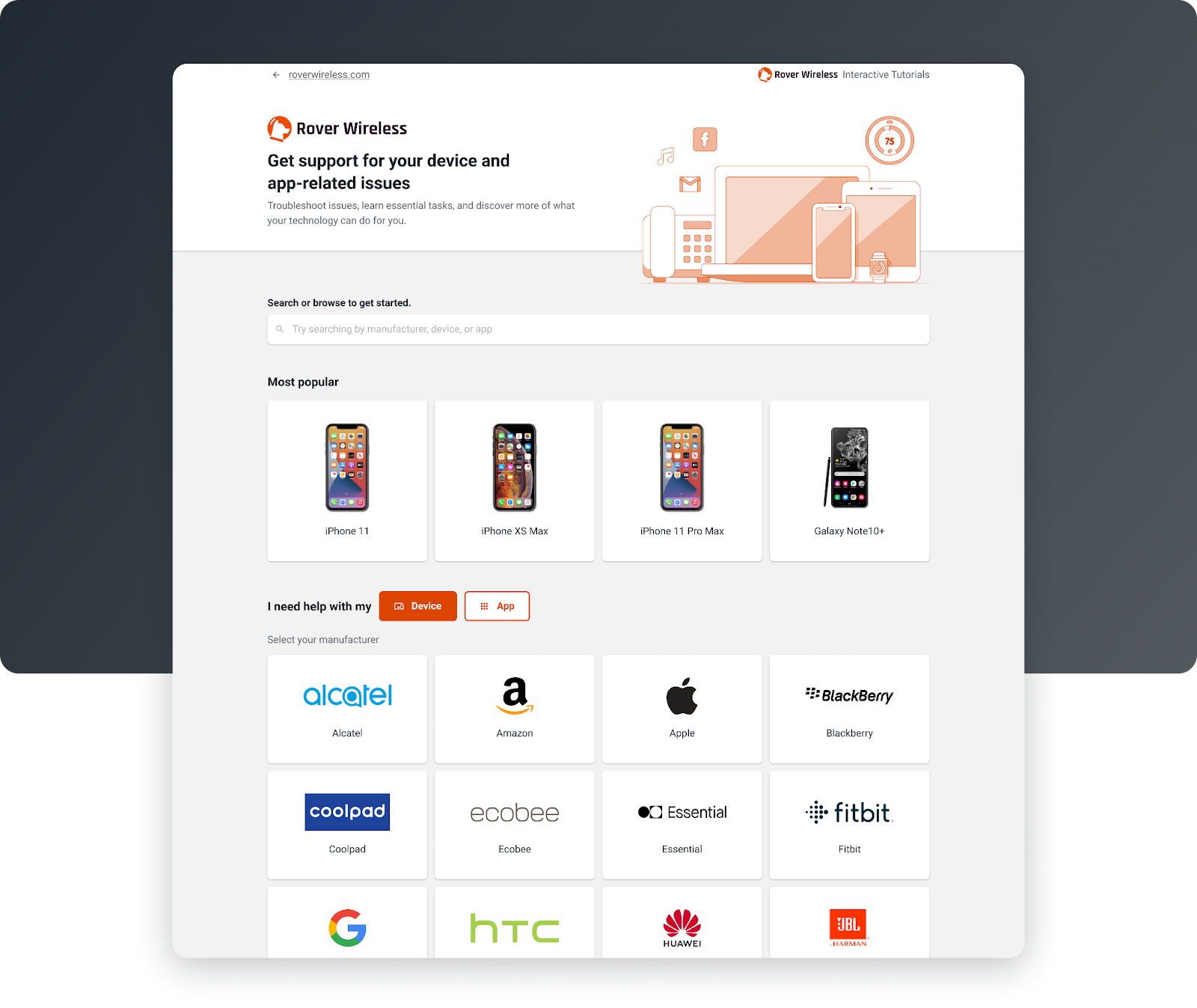
Depending on the integration method of our self-serve content, many customers were starting their path by orienting themselves with their device or app they have questions about. This device and app selection process, or flow as we refer to it, had areas for improvement. In other words, there was only one option for how you could find your specific device and app. This initial step was for many, the gateway to arriving at a potential solution. What if this process of finding a device or app could be better optimized? Could we take some cues from what’s become typical e-commerce and offer many alternative ways of selecting your device?
Hypothesis #2: The appearance of the device and app selection step could be modernized and more consistent to foster additional trust with our customers.
As a team of product designers, our more typical tasks are thinking about the experience of the software we’re designing - how a user moves from one area to another and how that movement delivers them to their goal. Additionally, we concern ourselves with how the aesthetic or visual appearance of our products influence our users and how it makes them feel.
Did arriving at this first step feel like a warm welcome for customers? What are we communicating to individuals in need of support?
Hypothesis #3: The amount of content and possible solutions presented at this point in the user journey could be streamlined for better decision-making.
Ultimately, in any design process, too many choices for a user can possibly lead to no choices being made at all, a concept otherwise known as decision paralysis. As users seek help and support after choosing a specific device or app, Ozmo exposes all relevant support content. Here, they’re now faced with finding a solution that sounds appropriate for their specific, unique problem.
The impressive amount of tutorial content that exists for a single device or app necessitates layers of categorization, which essentially resulted in a lot of work for a user trying to navigate their device while still on the lookout for their anticipated solution. How can we keep this feeling approachable and digestible?
Ideation
With all of these hypotheses in mind, several rounds of ideation and brainstorming across teams of designers, engineers and product ensued. At Ozmo, we believe in plentiful ideas and teams of cross-discipline cohorts are the best to deliver them.
Ideas in hand, the Ozmo Experience & Design team laid out milestones and dug into some rapid research and investigation. With industry and competitive insights, several experiments emerged where we quickly exposed new ideas into our products to see what moved the needle and performed better. Experiments lead to confidence in possible new features or shifts in user flows, which lead to user testing and more iteration and refinement. This brings us to Ozmo 3.2.
What’s new for customer self serve in release 3.2
Look, feel and usability
Across both steps in our product journey -- selecting a device or app and then subsequently finding answers -- our research suggested that we needed to modernize our aesthetic and strengthen our relationship with possible users. Trust is paramount, especially in a support-scenario where a customer might already be frustrated or stressed.
At the initial device or app selection step, visual improvements to hierarchy and emphasis were made to help users easily find their preferred starting point and begin their search for solutions. We created clear distinctions between possible device and app selection opportunities making sure our rhythm, spacing and sizing all supported a user in understanding what's related and what belongs together.
The team also investigated and improved on the verbiage across this initial step. In what we fondly refer to as the “economy of language”, we examined what we’re saying to our users and shifted towards being as succinct as possible while still speaking in a human-like, friendly way. All these changes influenced how this initial step was perceived. Users felt secure that they were now on a pathway to their support content, as expected.
The Experience & Design team carried this visual consistency across the full product, ensuring a sense of familiarity as a user selects their device or app and then shifts into the following step of exposing support topics.
Once at the support topic selection step, our research and experimentation found our assumption valid: the way we were presenting our content was overwhelming. From a visual standpoint, our resulting solution here aimed for simplicity. Blurbs of unnecessary text were chopped and the search bar was emphasized and visually distinguished.
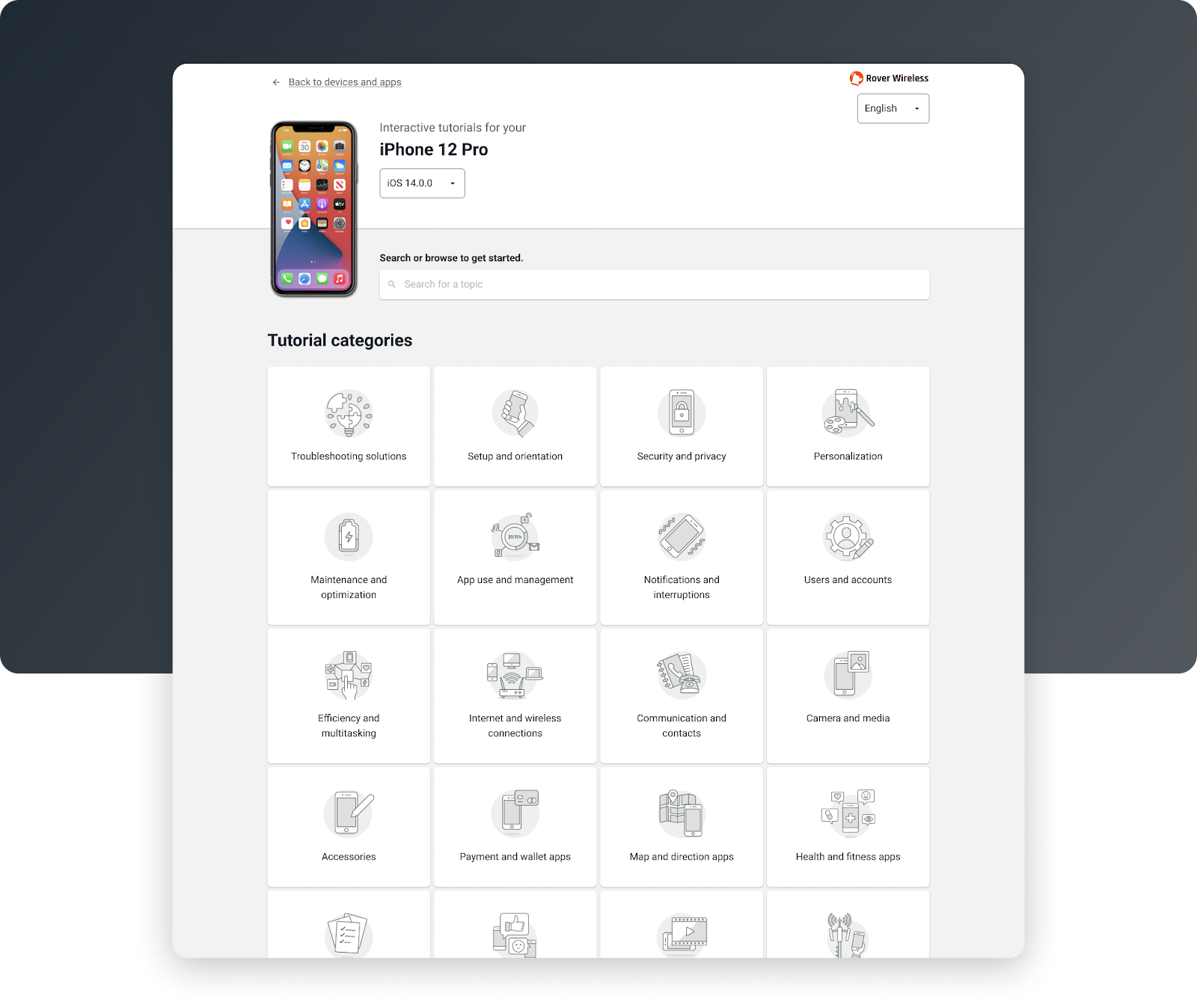
Perhaps the biggest change here was to shift all available topics into a tile pattern, where each possible category of support could be presented in a simple, more pleasing grid of iconographic tiles.
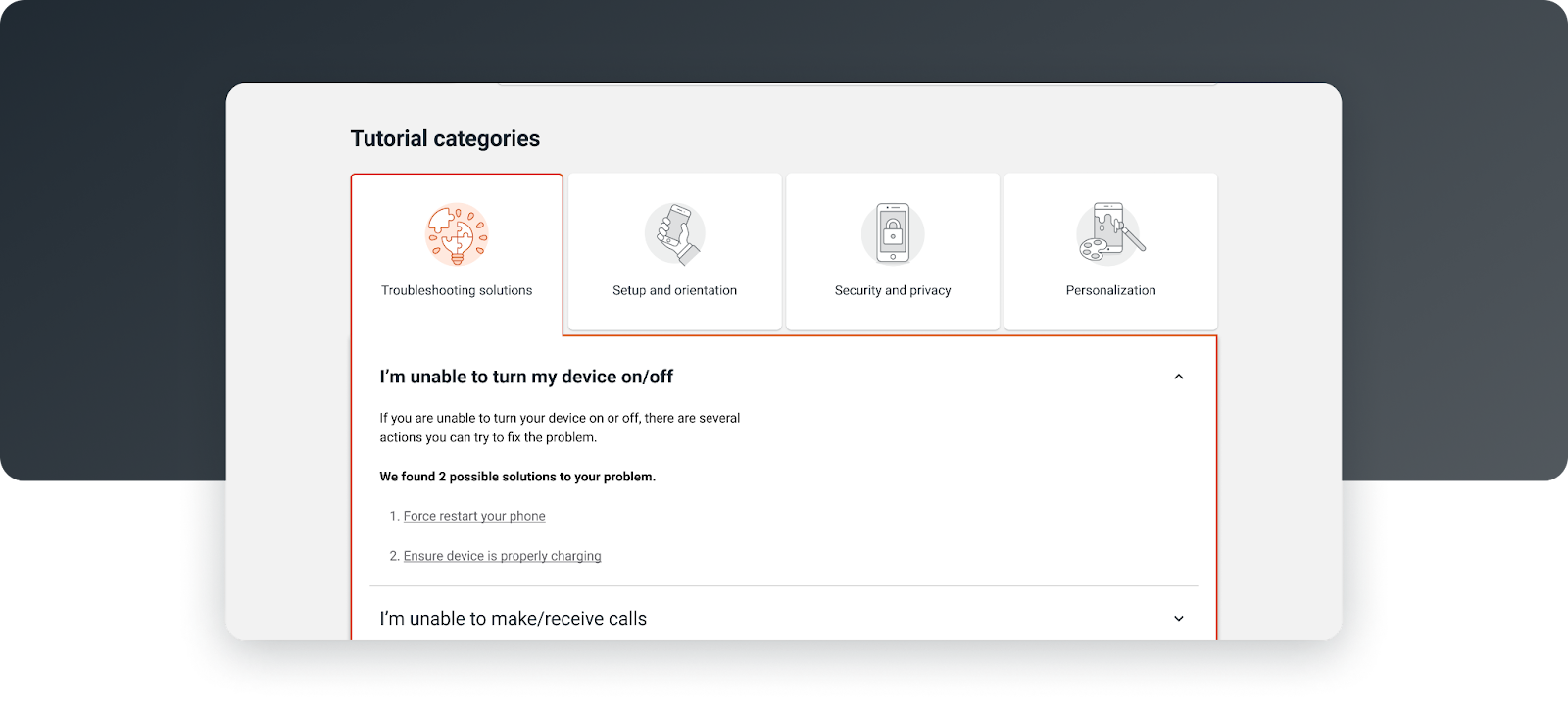
Simply clicking on a category tile causes it to expand, revealing additional layers of sub-categories and topics that could be quickly examined. Using a mixture of these tiles and subsequent accordions tested overwhelmingly positive in user tests where we heard feedback like “It looks easy to navigate”, “I think it makes sense. It's simple. It's systematic”.
The sweet sound of user validation: a Product Designer’s dream.
New features
Not only did we make improvements to the aesthetic of self support and how we are re-establishing a trustworthy feeling experience, we also refined how users can sift through a collection of topics with less stress and more efficiency. As for our remaining hypothesis, would having more avenues guide more users to various topics?
Our research and investigation pointed to yes, it would.
Circling back to our aforementioned ideas, the Experience & Design team needed to take our device and app selection process from a single, lone highway to a multi-directional interstate system. Our ideas were shifted into experiments and then back into an iterative design process with user testing throughout to ensure optimal usability.
Here are the features that bubbled to the surface as part of the product in 3.2.
Popular tiles
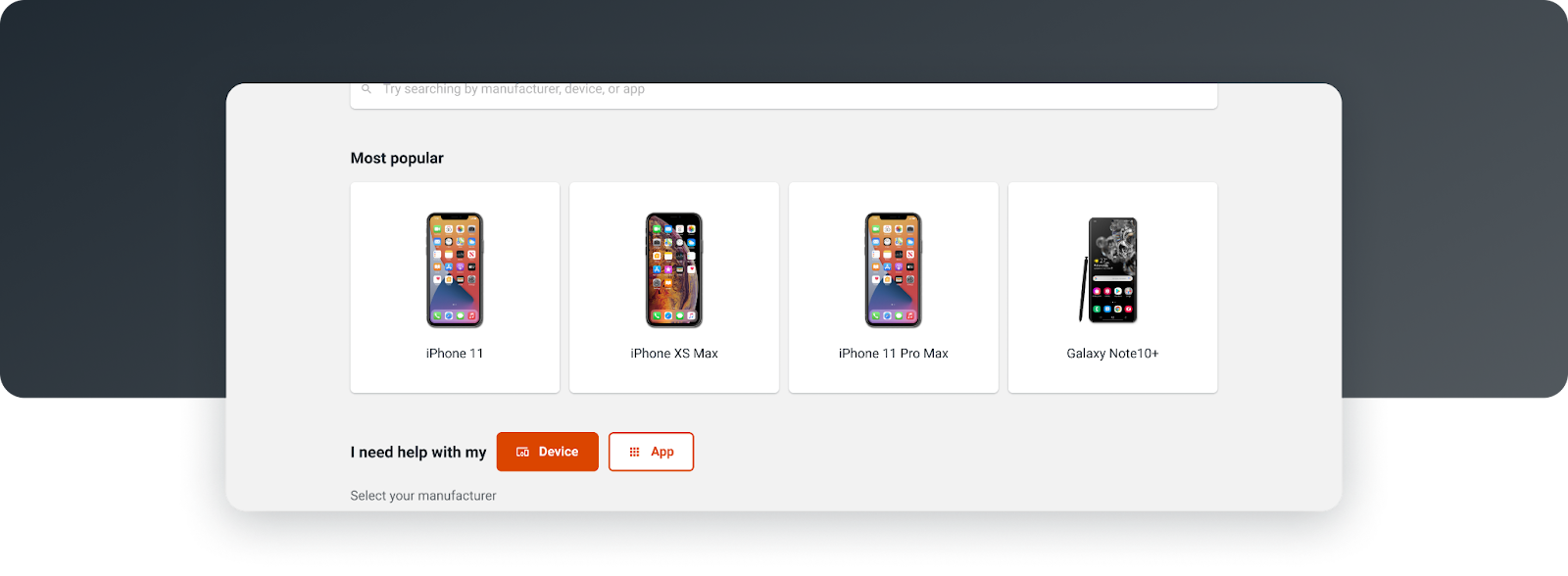
At the step of finding and selecting your device or app, Ozmo is introducing popular devices. This assortment of devices is dynamically presented based on utilization metrics relevant to each of our customers. This set of tiles acts as a pathway for users to see their device immediately and jump right into content relevant for them. This achieves both a new route in along with increased efficiency by providing a faster means to possible solutions and content.
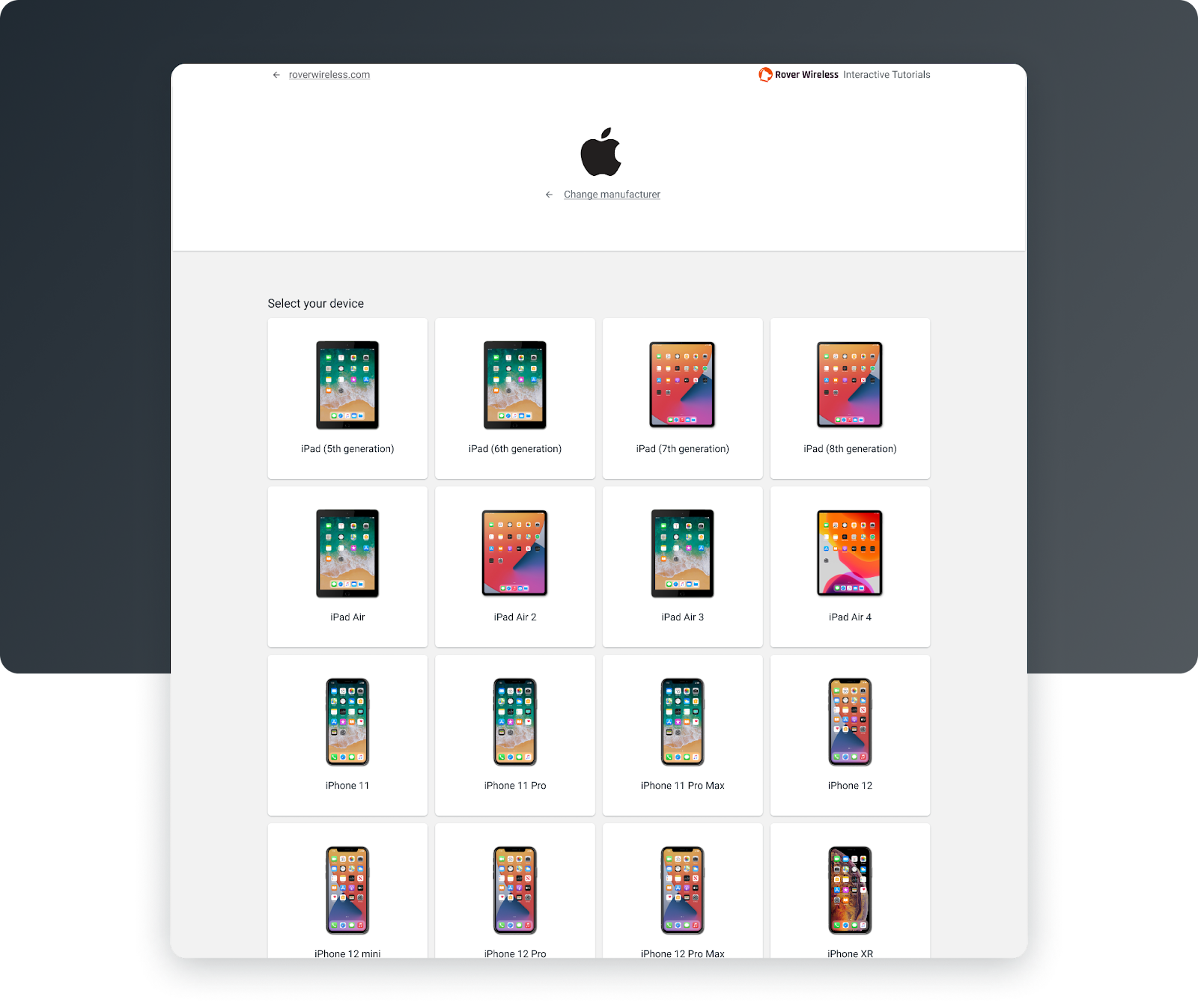
Tile selection
With 3.2, an entirely new method of finding and selecting a device or app has been layered into the product. Users are now presented with a tile-selection pattern, highlighting manufacturers and their branding as a recognizable first step in choosing their device or app for relevant topics. Upon choosing the manufacturer of your device or app, a secondary set of tiles are exposed, showcasing device or app imagery along with clear labels. This pattern feels fast and simple but leans into a more scannable, visual approach to selecting a device or app.
The future of customer self serve
All in all, Ozmo's self-serve portal is now more polished and congruent for its customers. A user’s steps to answers and problem resolution have become more varied, which has allowed us to capture a broader set of users and understand how they might be uniquely seeking support.
As with any major release, we are keeping an eye on the data. Post-release validation is an important part of Ozmo’s product design and development process. Any indications of change in metrics or behavior will be our guiding light to dig in deeper with more user testing and investigation, ultimately driving continued iteration and improvement of our product.
Want to see how Ozmo's new 3.2 advancements can help improve your customer self serve? Request a free demo with our team of experts to get exclusive information and product details on our customer self-serve solutions and how they can transform your business today.